# 1. 載入 ggplot2 繪圖套件
library(ggplot2)

# 2. 建立流感疫苗 2x2 列聯表
# 矩陣排列方式:列為組別,行為流感狀態 (罹病, 健康)
contingency_table <- matrix(c(5, 55, 15, 45), nrow = 2, byrow = TRUE)
rownames(contingency_table) <- c("疫苗組 (Vaccine)", "對照組 (Placebo)")
colnames(contingency_table) <- c("罹患流感 (Flu Yes)", "未罹患流感 (Flu No)")

# 3. 執行卡方獨立性檢定
# correct = TRUE 代表執行 Yates 連續性修正 (預設值)
chi_yates_res <- chisq.test(contingency_table, correct = TRUE)

# correct = FALSE 代表不執行修正
chi_raw_res <- chisq.test(contingency_table, correct = FALSE)

# 4. 執行費雪精確檢定 (Fisher's Exact Test)
fisher_test_res <- fisher.test(contingency_table)

# 輸出結果
cat("=========================================\n")
cat(" 2x2 列聯表原始數據\n")
cat("=========================================\n")
print(contingency_table)

cat("\n=========================================\n")
cat(" 卡方檢定結果 (含 Yates 連續性修正)\n")
cat("=========================================\n")
print(chi_yates_res)
cat("期望頻數 (Expected Frequencies):\n")
print(chi_yates_res$expected)

cat("\n=========================================\n")
cat(" 費雪精確檢定結果\n")
cat("=========================================\n")
print(fisher_test_res)

# =======================================================
# 5. 資料整理與 ggplot2 分組百分比長條圖繪製
# =======================================================
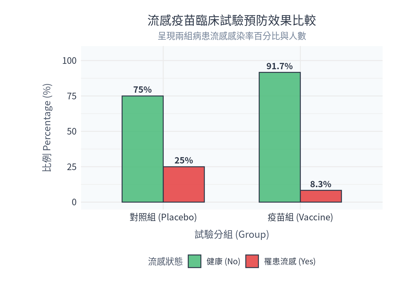
plot_df <- data.frame(
  Group = c("疫苗組 (Vaccine)", "疫苗組 (Vaccine)", "對照組 (Placebo)", "對照組 (Placebo)"),
  Status = c("罹患流感 (Yes)", "健康 (No)", "罹患流感 (Yes)", "健康 (No)"),
  Count = c(5, 55, 15, 45)
)

# 計算組內百分比 (疫苗組基數 60, 對照組基數 60)
plot_df$Percentage <- c(5/60, 55/60, 15/60, 45/60) * 100

p_bar <- ggplot(plot_df, aes(x = Group, y = Percentage, fill = Status)) +
  # 繪製分組長條圖 (dodge 代表並排)
  geom_col(position = "dodge", alpha = 0.85, color = "#2d3748", width = 0.6) +
  # 在長條上方加入百分比標籤
  geom_text(aes(label = paste0(round(Percentage, 1), "%")),
            position = position_dodge(0.6), vjust = -0.5, size = 3.8,
            color = "#2d3748", family = "Noto Sans CJK TC", fontface = "bold") +
  scale_fill_manual(values = c("健康 (No)" = "#48bb78", "罹患流感 (Yes)" = "#e53e3e")) +
  scale_y_continuous(limits = c(0, 105)) +
  labs(
    title = "流感疫苗臨床試驗預防效果比較",
    subtitle = "呈現兩組病患流感感染率百分比與人數",
    x = "試驗分組 (Group)",
    y = "比例 Percentage (%)",
    fill = "流感狀態"
  ) +
  theme_minimal(base_family = "Noto Sans CJK TC", base_size = 12) + # Windows 請替換為 Microsoft JhengHei
  theme(
    plot.title = element_text(size = 15, hjust = 0.5, color = "#2d3748", lineheight = 1.1),
    plot.subtitle = element_text(size = 11, hjust = 0.5, color = "#718096"),
    axis.title = element_text(size = 12, color = "#4a5568"),
    axis.title.x = element_text(margin = margin(t = 10)),
    axis.title.y = element_text(margin = margin(r = 12)),
    axis.text = element_text(size = 11, color = "#2d3748"),
    legend.title = element_text(size = 11, color = "#4a5568"),
    legend.text = element_text(size = 10, color = "#2d3748"),
    legend.position = "bottom",
    panel.background = element_rect(fill = "#f7fafc", color = NA),
    plot.background = element_rect(fill = "white", color = NA),
    plot.margin = margin(20, 28, 20, 54)
  )

# 顯示圖檔
print(p_bar)