# 1. 載入 ggplot2 繪圖套件
library(ggplot2)

# 2. 輸入 20 位患者的血清膽固醇數值 (mg/dL)
chol_data <- data.frame(
  PatientID = paste0("ID_", 1:20),
  Cholesterol = c(220, 195, 240, 188, 310, 215, 205, 250, 190, 225,
                  235, 175, 260, 280, 200, 218, 230, 245, 290, 160)
)

# 3. 計算中心趨勢量度
mean_val <- mean(chol_data$Cholesterol)
median_val <- median(chol_data$Cholesterol)

# 4. 計算離散趨勢量度
sd_val <- sd(chol_data$Cholesterol)
var_val <- var(chol_data$Cholesterol)
range_val <- range(chol_data$Cholesterol)
diff_range <- diff(range_val) # 最大值減最小值,即全距
cv_val <- (sd_val / mean_val) * 100

# 5. 印出計算結果
cat("--- 膽固醇數據描述統計結果 ---\n")
cat("算術平均數 (Mean)     :", mean_val, "mg/dL\n")
cat("中位數 (Median)       :", median_val, "mg/dL\n")
cat("標準差 (SD)           :", sd_val, "mg/dL\n")
cat("變異數 (Variance)     :", var_val, "\n")
cat("全距 (Range)          :", range_val[1], "~", range_val[2], " (全距大小 =", diff_range, ")\n")
cat("變異係數 (CV)         :", round(cv_val, 2), "%\n")
cat("-----------------------------\n")

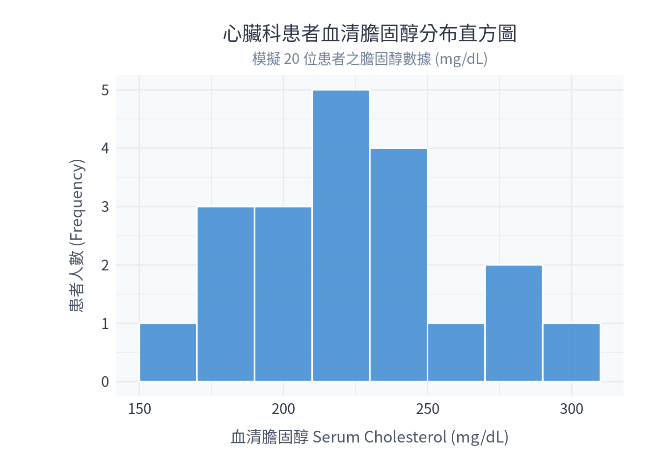
# 6. 使用 ggplot2 繪製直方圖
h_plot <- ggplot(chol_data, aes(x = Cholesterol)) +
  geom_histogram(binwidth = 20, fill = "#3182ce", color = "white", alpha = 0.8) +
  labs(
    title = "心臟科患者血清膽固醇分布直方圖",
    subtitle = "模擬 20 位患者之膽固醇數據 (mg/dL)",
    x = "血清膽固醇 Serum Cholesterol (mg/dL)",
    y = "患者人數 (Frequency)"
  ) +
  theme_minimal(base_family = "Noto Sans CJK TC", base_size = 12) + # Windows 請替換為 Microsoft JhengHei
  theme(
    plot.title = element_text(size = 15, hjust = 0.5, color = "#2d3748", lineheight = 1.1),
    plot.subtitle = element_text(size = 11, hjust = 0.5, color = "#718096"),
    axis.title = element_text(size = 12, color = "#4a5568"),
    axis.title.x = element_text(margin = margin(t = 10)),
    axis.title.y = element_text(margin = margin(r = 12)),
    axis.text = element_text(size = 11, color = "#2d3748"),
    panel.background = element_rect(fill = "#f7fafc", color = NA),
    plot.background = element_rect(fill = "white", color = NA),
    plot.margin = margin(20, 28, 20, 54)
  )

# 顯示直方圖
print(h_plot)

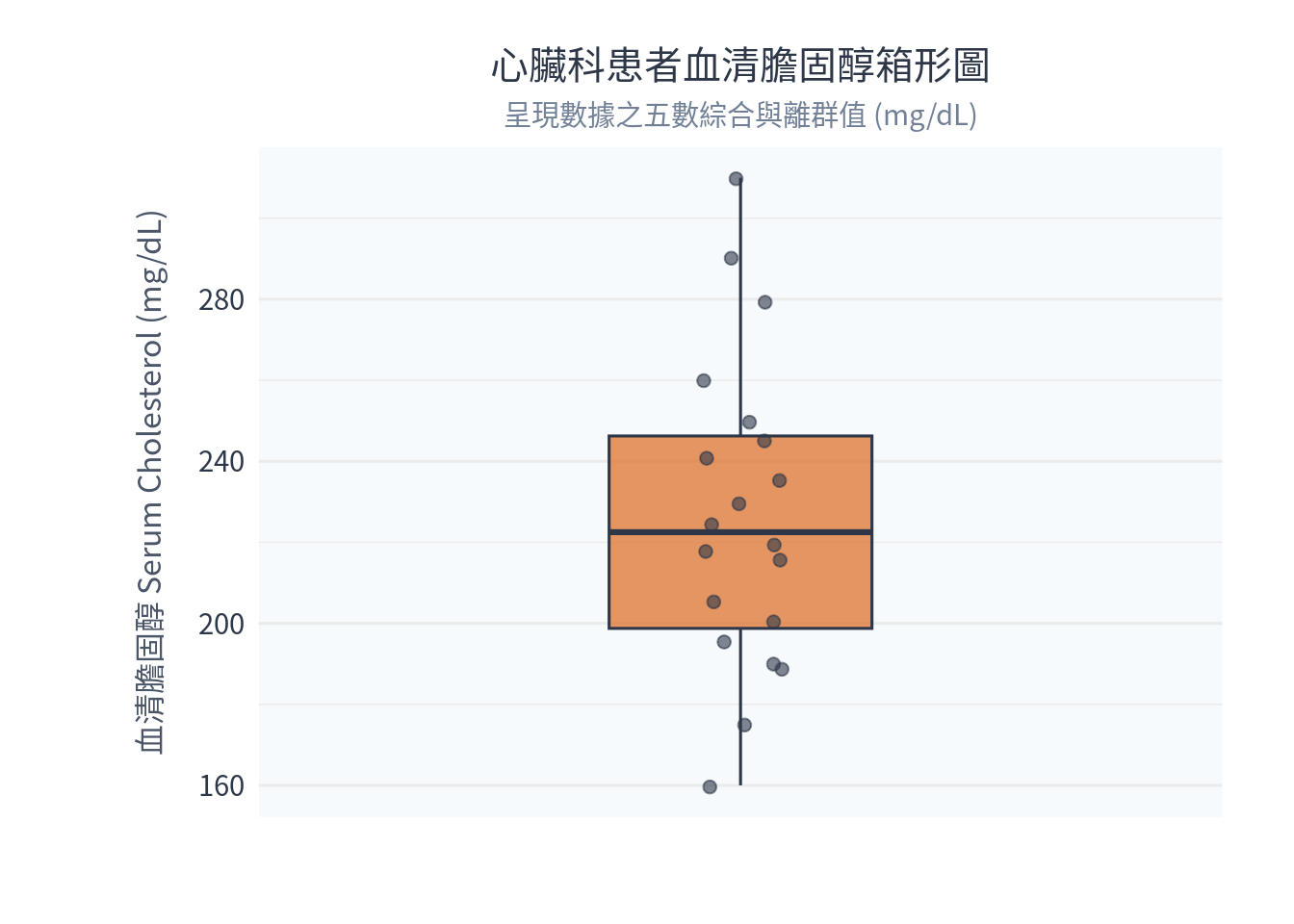
# 7. 使用 ggplot2 繪製箱形圖
b_plot <- ggplot(chol_data, aes(y = Cholesterol)) +
  geom_boxplot(fill = "#dd6b20", color = "#2d3748", alpha = 0.7, width = 0.3) +
  geom_jitter(aes(x = 0), width = 0.05, color = "#2d3748", alpha = 0.6, size = 2) +
  scale_x_continuous(limits = c(-0.5, 0.5), breaks = NULL) +
  labs(
    title = "心臟科患者血清膽固醇箱形圖",
    subtitle = "呈現數據之五數綜合與離群值 (mg/dL)",
    x = "",
    y = "血清膽固醇 Serum Cholesterol (mg/dL)"
  ) +
  theme_minimal(base_family = "Noto Sans CJK TC", base_size = 12) + # Windows 請替換為 Microsoft JhengHei
  theme(
    plot.title = element_text(size = 15, hjust = 0.5, color = "#2d3748", lineheight = 1.1),
    plot.subtitle = element_text(size = 11, hjust = 0.5, color = "#718096"),
    axis.title = element_text(size = 12, color = "#4a5568"),
    axis.title.x = element_text(margin = margin(t = 10)),
    axis.title.y = element_text(margin = margin(r = 12)),
    axis.text = element_text(size = 11, color = "#2d3748"),
    panel.background = element_rect(fill = "#f7fafc", color = NA),
    plot.background = element_rect(fill = "white", color = NA),
    plot.margin = margin(20, 28, 20, 54)
  )

# 顯示箱形圖
print(b_plot)