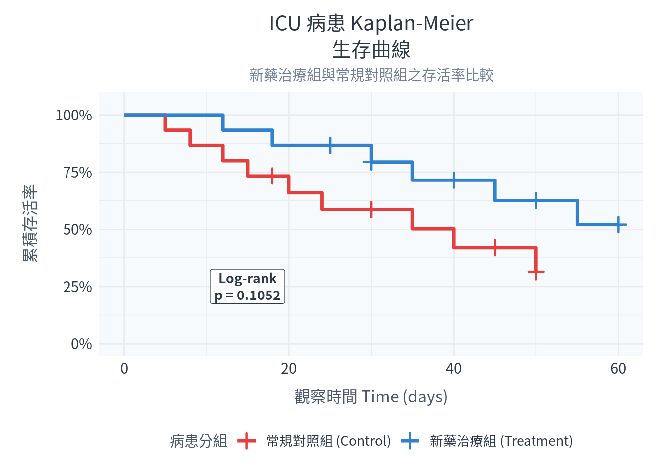
# 1. 載入必備套件
library(survival)
library(ggplot2)

# 2. 建立 ICU 病患存活模擬數據
set.seed(77)

# 新藥治療組 (n=15):生存時間較長,設限比例高
time_treat <- c(12, 18, 25, 30, 30, 35, 40, 45, 50, 55, 60, 60, 60, 60, 60)
status_treat <- c(1, 1, 0, 1, 0, 1, 0, 1, 0, 1, 0, 0, 0, 0, 0) # 0 = 設限, 1 = 死亡

# 常規對照組 (n=15):生存時間較短,死亡比例高
time_ctrl <- c(5, 8, 12, 15, 18, 20, 24, 30, 35, 40, 45, 50, 50, 50, 50)
status_ctrl <- c(1, 1, 1, 1, 0, 1, 1, 0, 1, 1, 0, 1, 0, 0, 0)

# 合併成資料框
surv_df <- data.frame(
  Time = c(time_treat, time_ctrl),
  Status = c(status_treat, status_ctrl),
  Group = factor(c(rep("新藥治療組 (Treatment)", 15), rep("常規對照組 (Control)", 15)))
)

# 3. 建立存活物件並進行 Kaplan-Meier 估計
# Surv(Time, Status) 會將時間與事件狀態結合成存活分析專用格式
fit <- survfit(Surv(Time, Status) ~ Group, data = surv_df)

# 4. 執行 Log-rank 檢定比較兩組存活曲線
logrank_res <- survdiff(Surv(Time, Status) ~ Group, data = surv_df)
p_val <- 1 - pchisq(logrank_res$chisq, df = length(logrank_res$n) - 1)

# 5. 建立 Cox 比例風險模式
cox_model <- coxph(Surv(Time, Status) ~ Group, data = surv_df)
cox_summary <- summary(cox_model)

# 6. 輸出控制台分析結果
cat("=========================================\n")
cat(" 實作一:Log-rank 檢定結果\n")
cat("=========================================\n")
print(logrank_res)
cat("Log-rank Test p-value:", round(p_val, 5), "\n")

cat("\n=========================================\n")
cat(" 實作二:Cox 比例風險模式結果\n")
cat("=========================================\n")
print(cox_summary)

# =======================================================
# 7. 整理存活曲線數據並以 ggplot2 繪圖
# =======================================================
# 提取生存估計摘要
fit_summary <- summary(fit, censored = TRUE)
fit_df <- data.frame(
  Time = fit_summary$time,
  Survival = fit_summary$surv,
  Censored = fit_summary$n.censor,
  Group = fit_summary$strata
)
# 清理分組名稱
fit_df$Group <- gsub("Group=", "", fit_df$Group)

# 加入時間 0,累積存活率 100% 的起點,讓曲線從最左側開始
t_start <- data.frame(
  Time = c(0, 0),
  Survival = c(1, 1),
  Censored = c(0, 0),
  Group = c("常規對照組 (Control)", "新藥治療組 (Treatment)")
)
fit_plot_df <- rbind(t_start, fit_df)

# 篩選出有設限點的數據列,用於在地圖上點綴 + 號
censor_points <- subset(fit_plot_df, Censored > 0)

# 繪製生存階梯圖
p_surv <- ggplot(fit_plot_df, aes(x = Time, y = Survival, color = Group)) +
  # geom_step 專門用於繪製存活曲線的階梯狀走勢
  geom_step(linewidth = 1.2) +
  # 繪製設限標記 (shape = 3 代表十字 "+" 號)
  geom_point(data = censor_points, aes(x = Time, y = Survival), shape = 3, size = 3, stroke = 1.2) +
  scale_color_manual(values = c("常規對照組 (Control)" = "#e53e3e", "新藥治療組 (Treatment)" = "#3182ce")) +
  scale_y_continuous(limits = c(0, 1.05), labels = scales::percent) +
  # 標註 Log-rank 檢定之 p 值
  annotate("label", x = 15, y = 0.25, label = paste("Log-rank\np =", round(p_val, 4)),
           size = 3.5, color = "#2d3748", family = "Noto Sans CJK TC", fontface = "bold",
           fill = "white", alpha = 0.85, linewidth = 0.2, lineheight = 1.05) +
  labs(
    title = "ICU 病患 Kaplan-Meier\n生存曲線",
    subtitle = "新藥治療組與常規對照組之存活率比較",
    x = "觀察時間 Time (days)",
    y = "累積存活率",
    color = "病患分組"
  ) +
  theme_minimal(base_family = "Noto Sans CJK TC", base_size = 12) + # Windows系統請替換為 Microsoft JhengHei
  theme(
    plot.title = element_text(size = 15, hjust = 0.5, color = "#2d3748", lineheight = 1.1),
    plot.subtitle = element_text(size = 11, hjust = 0.5, color = "#718096"),
    axis.title = element_text(size = 12, color = "#4a5568"),
    axis.title.x = element_text(margin = margin(t = 10)),
    axis.title.y = element_text(margin = margin(r = 12)),
    axis.text = element_text(size = 11, color = "#2d3748"),
    legend.title = element_text(size = 11, color = "#4a5568"),
    legend.text = element_text(size = 10, color = "#2d3748"),
    legend.position = "bottom",
    panel.background = element_rect(fill = "#f7fafc", color = NA),
    plot.background = element_rect(fill = "white", color = NA),
    plot.margin = margin(12, 18, 12, 18)
  )

# 顯示圖檔
print(p_surv)