# 1. 載入 ggplot2 繪圖套件
library(ggplot2)

# 2. 模擬生成疼痛等級數據 (1 到 10 分)
set.seed(88)
pain_before <- c(8, 7, 9, 6, 8, 10, 7, 9, 8, 6, 9, 8)
# 穴位按壓組治療後 (疼痛分數下降)
pain_after  <- c(4, 3, 5, 4, 3,  6, 5, 4, 5, 2, 4, 5)

# 對照組 (假按壓治療後,疼痛分數降幅較小)
pain_control <- c(7, 6, 8, 5, 7, 9, 6, 8, 7, 5, 8, 6)

# =======================================================
# 實作一:配對 Wilcoxon 符號等級檢定 (穴位按壓組前後比較)
# =======================================================
wilcox_paired_res <- wilcox.test(pain_before, pain_after, paired = TRUE)

# =======================================================
# 實作二:獨立樣本 Wilcoxon 秩和檢定 (按壓組後 vs. 對照組後)
# =======================================================
wilcox_ind_res <- wilcox.test(pain_after, pain_control, paired = FALSE)

# 輸出結果
cat("=========================================\n")
cat(" 實作一:Wilcoxon 符號等級檢定結果 (配對)\n")
cat("=========================================\n")
print(wilcox_paired_res)

cat("\n=========================================\n")
cat(" 實作二:Wilcoxon 秩和檢定結果 (獨立雙樣本)\n")
cat("=========================================\n")
print(wilcox_ind_res)

# =======================================================
# 3. 資料整理與 ggplot2 小提琴圖 (Violin Plot) 繪製
# =======================================================
plot_df <- data.frame(
  Group = factor(c(rep("穴位按壓組 (Acupressure)", 24), rep("對照組 (Control)", 12)),
                 levels = c("對照組 (Control)", "穴位按壓組 (Acupressure)")),
  Time = factor(c(rep("治療前 (Before)", 12), rep("治療後 (After)", 12), rep("治療後 (After)", 12)),
                levels = c("治療前 (Before)", "治療後 (After)")),
  PainScore = c(pain_before, pain_after, pain_control)
)

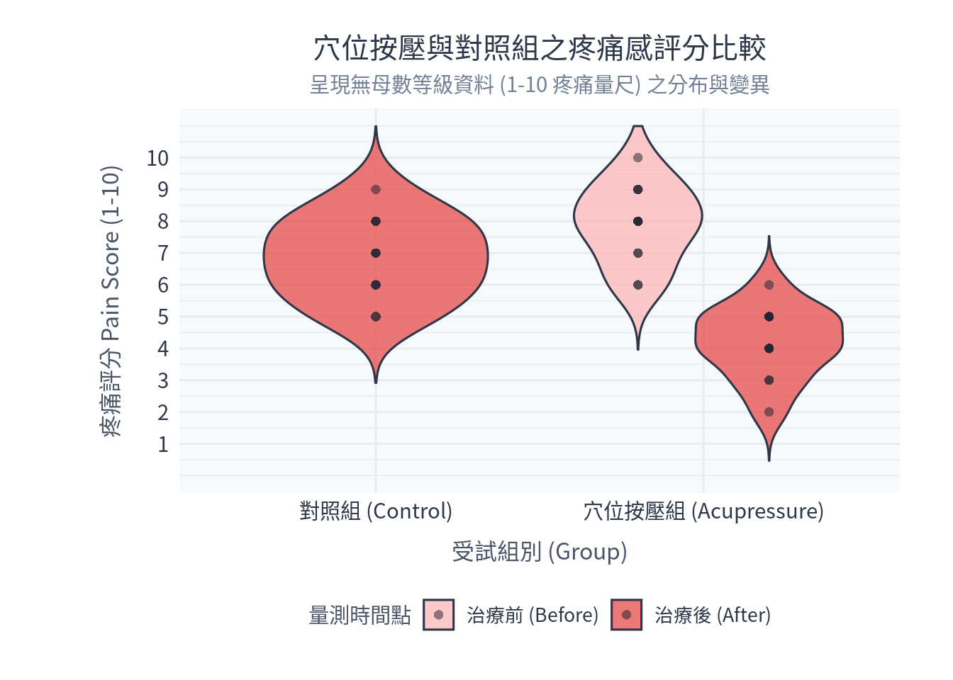
p_violin <- ggplot(plot_df, aes(x = Group, y = PainScore, fill = Time)) +
  # 繪製小提琴圖
  geom_violin(trim = FALSE, alpha = 0.7, color = "#2d3748", position = position_dodge(0.8)) +
  # 重疊繪製個別患者的疼痛數據散佈點 (使用 jitter 避免重疊)
  geom_jitter(shape = 16, position = position_dodge(0.8), color = "#1a202c", size = 2, alpha = 0.5) +
  scale_fill_manual(values = c("治療前 (Before)" = "#feb2b2", "治療後 (After)" = "#e53e3e")) +
  scale_y_continuous(limits = c(0, 11), breaks = 1:10) +
  labs(
    title = "穴位按壓與對照組之疼痛感評分比較",
    subtitle = "呈現無母數等級資料 (1-10 疼痛量尺) 之分布與變異",
    x = "受試組別 (Group)",
    y = "疼痛評分 Pain Score (1-10)",
    fill = "量測時間點"
  ) +
  theme_minimal(base_family = "Noto Sans CJK TC", base_size = 12) + # Windows 請替換為 Microsoft JhengHei
  theme(
    plot.title = element_text(size = 15, hjust = 0.5, color = "#2d3748", lineheight = 1.1),
    plot.subtitle = element_text(size = 11, hjust = 0.5, color = "#718096"),
    axis.title = element_text(size = 12, color = "#4a5568"),
    axis.title.x = element_text(margin = margin(t = 10)),
    axis.title.y = element_text(margin = margin(r = 12)),
    axis.text = element_text(size = 11, color = "#2d3748"),
    legend.title = element_text(size = 11, color = "#4a5568"),
    legend.text = element_text(size = 10, color = "#2d3748"),
    legend.position = "bottom",
    panel.background = element_rect(fill = "#f7fafc", color = NA),
    plot.background = element_rect(fill = "white", color = NA),
    plot.margin = margin(20, 28, 20, 54)
  )

# 顯示圖檔
print(p_violin)