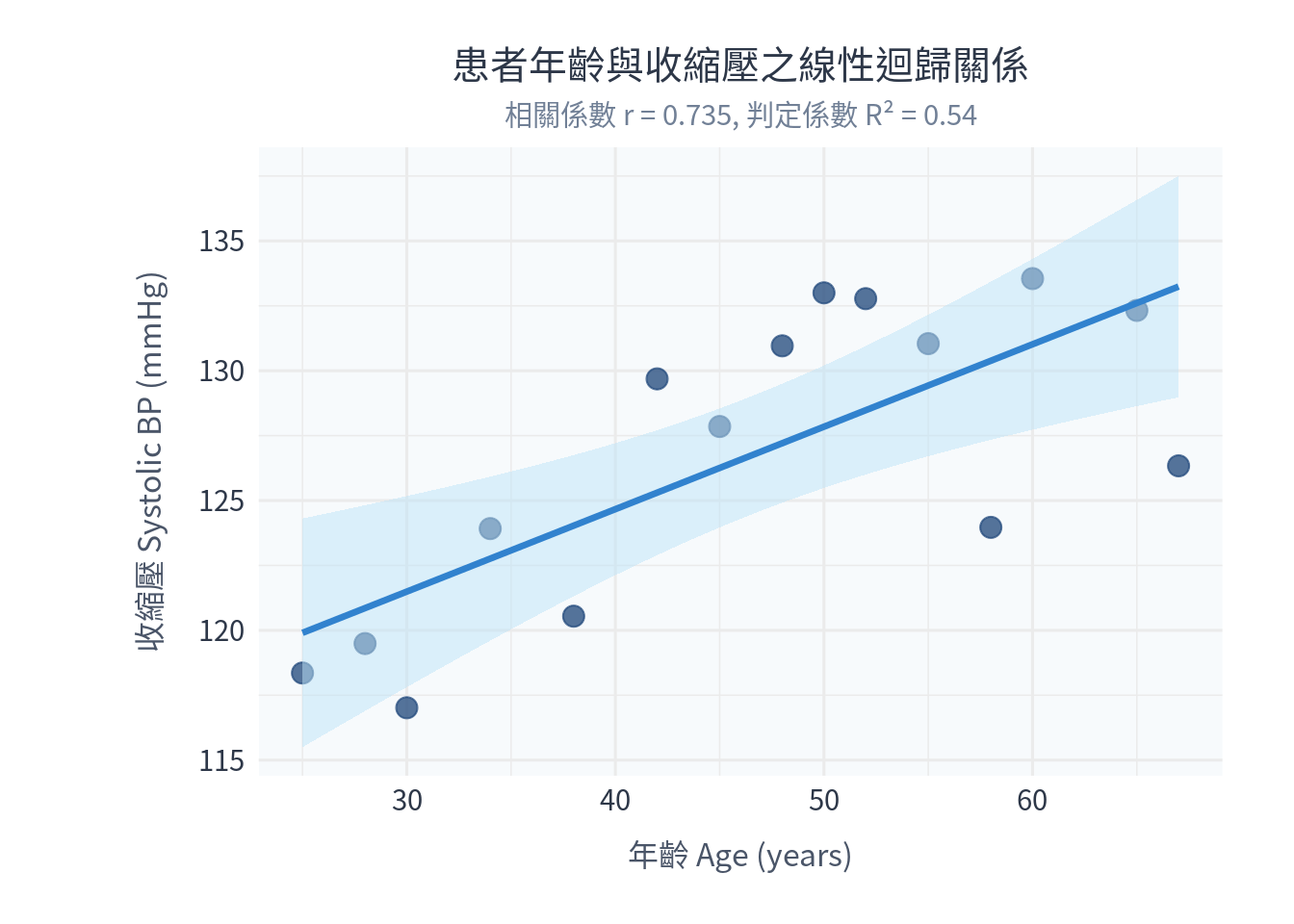
# 1. 載入 ggplot2 繪圖套件
library(ggplot2)

# 2. 模擬生成 15 位受試者的年齡與收縮壓數據
set.seed(99)
age_vals <- c(25, 34, 45, 52, 60, 28, 38, 48, 55, 65, 30, 42, 50, 58, 67)
# 設定線性關係,加上隨機雜訊
sbp_vals <- 105 + 0.5 * age_vals + rnorm(15, mean = 0, sd = 4)

df_reg <- data.frame(Age = age_vals, SBP = sbp_vals)

# =======================================================
# 實作一:皮爾森相關分析
# =======================================================
cor_res <- cor.test(df_reg$Age, df_reg$SBP)

# =======================================================
# 實作二:簡單線性迴歸分析 (SBP ~ Age)
# =======================================================
# lm() 是 R 中建構線性模型 (linear model) 的核心函數
lm_model <- lm(SBP ~ Age, data = df_reg)
lm_summary <- summary(lm_model)

# 輸出統計結果
cat("=========================================\n")
cat(" 實作一:皮爾森相關分析結果\n")
cat("=========================================\n")
cat("相關係數 r         :", round(cor_res$estimate, 4), "\n")
cat("95% 信賴區間       : [", round(cor_res$conf.int[1], 4), ",", round(cor_res$conf.int[2], 4), "]\n")
cat("相關性檢定 p 值    :", round(cor_res$p.value, 4), "\n\n")

cat("=========================================\n")
cat(" 實作二:簡單線性迴歸分析結果\n")
cat("=========================================\n")
print(lm_summary)

# =======================================================
# 3. 使用 ggplot2 繪製散佈圖與迴歸線及 95% 信賴區間帶
# =======================================================
p_reg <- ggplot(df_reg, aes(x = Age, y = SBP)) +
  # 繪製病患原始散佈點
  geom_point(size = 3.5, color = "#2c5282", alpha = 0.8) +
  # geom_smooth() 配合 method="lm" 與 se=TRUE 會自動繪製迴歸線與半透明信賴區間帶
  geom_smooth(method = "lm", se = TRUE, color = "#3182ce", fill = "#bee3f8", alpha = 0.5, linewidth = 1.2) +
  labs(
    title = "患者年齡與收縮壓之線性迴歸關係",
    subtitle = paste0("相關係數 r = ", round(cor_res$estimate, 3),
                     ", 判定係數 R² = ", round(lm_summary$r.squared, 3)),
    x = "年齡 Age (years)",
    y = "收縮壓 Systolic BP (mmHg)"
  ) +
  theme_minimal(base_family = "Noto Sans CJK TC", base_size = 12) + # Windows 請替換為 Microsoft JhengHei
  theme(
    plot.title = element_text(size = 15, hjust = 0.5, color = "#2d3748", lineheight = 1.1),
    plot.subtitle = element_text(size = 11, hjust = 0.5, color = "#718096"),
    axis.title = element_text(size = 12, color = "#4a5568"),
    axis.title.x = element_text(margin = margin(t = 10)),
    axis.title.y = element_text(margin = margin(r = 12)),
    axis.text = element_text(size = 11, color = "#2d3748"),
    panel.background = element_rect(fill = "#f7fafc", color = NA),
    plot.background = element_rect(fill = "white", color = NA),
    plot.margin = margin(20, 28, 20, 54)
  )

# 顯示圖檔
print(p_reg)